Product design that made an impact.
Designed and redefined a product system that defined how customers interact and understand ServiceNow Impact.
Role
Design Lead, Tank Design
Timeframe
1 year
Scope
Embed in ServiceNow Impact’s product team, leading UX end-to-end across the customer journey.
Deliverables
Annotated and detailed documentation of product components and product screens across breakpoints.
Expanded product design system documentation.
1
Problem
New product offering MVP entering into production without a cohesive customer experience and an incomplete design system.
2
Approach
Shipped MVP pages for user interviews. Leveraged CX and UX research findings to refine use cases and customer journeys. Defined visual motifs, grid structures, elevation maps, and user interaction principles.
3
Outcome
A fully shipped product with a complete customer experience and a scalable system to support continued growth.
TLDR
ServiceNow was still organizing their stories, synthesizing research, and locking down key features when Tank and I came on for the early UX exploration for a new product named Octane, later to be renamed ServiceNow Impact. I led the effort to strip the experience down to its essential structure, leaving less room for user error while following the new visual guidance.
I ran the team through round after round of the strongest options until we landed on a handful that solved the same problem with different organizational treatments. I worked directly with ServiceNow's UX, CX, research, engineering, and brand teams, presenting solutions, running design workshops, and leading QA reviews.
The project closed with annotated documentation covering every system motif, UI principle, color theory, accessible data visualization, system guidance, and dev spec.
Defining the Foundation
Based on test stimuli shown to users, I provided strategy and hands-on design thinking to shape user-centered treatments for each product function. We delivered mockups and prototypes to the research team to validate our solutions and surface feedback.
In this phase, my team and I defined the product's foundational visual and experiential principles. That work uncovered the key building blocks behind the decisions that shaped every user journey.
Once the atomic structure was solid, documentation began.
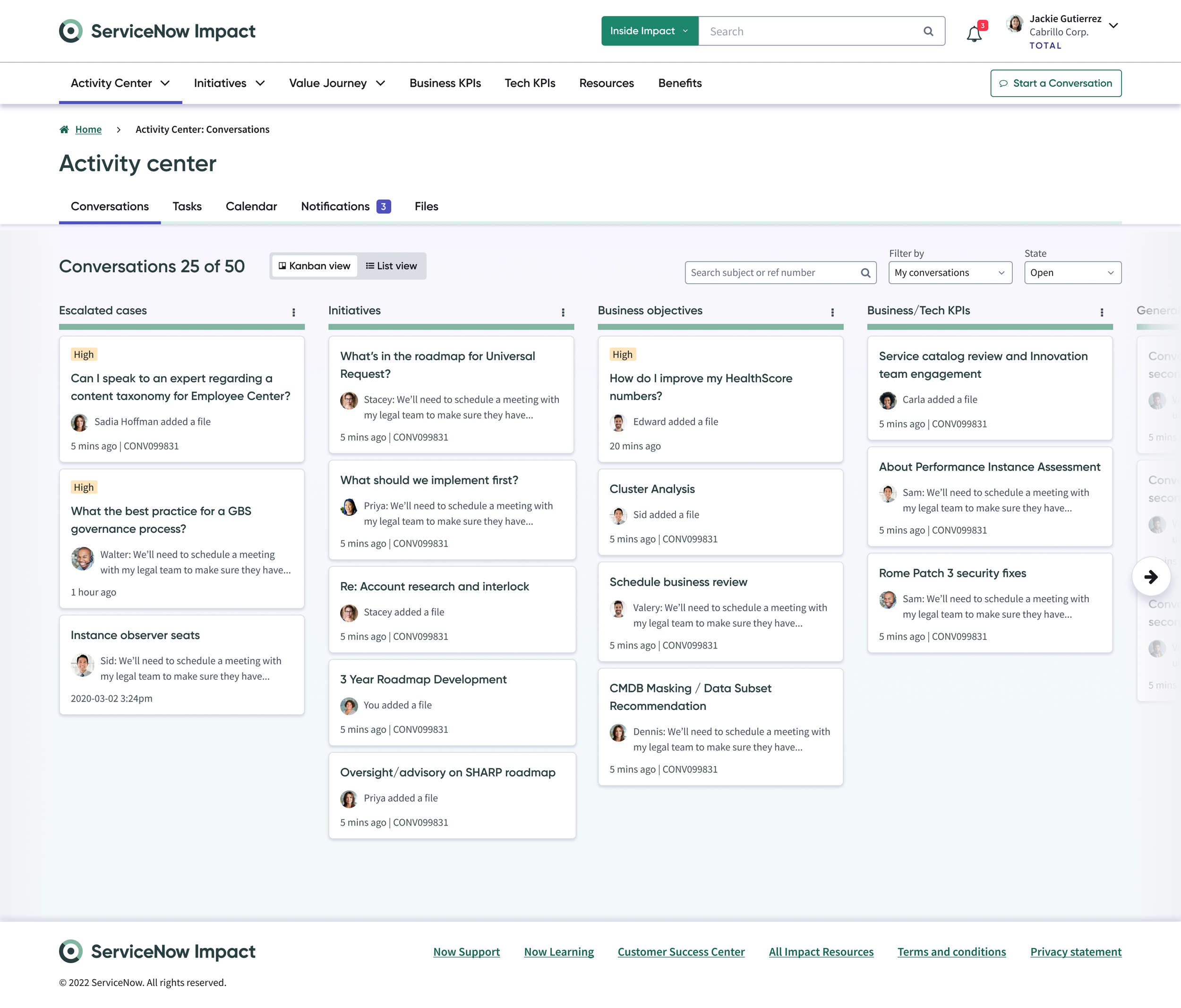
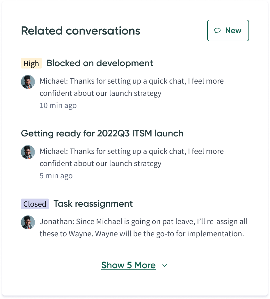
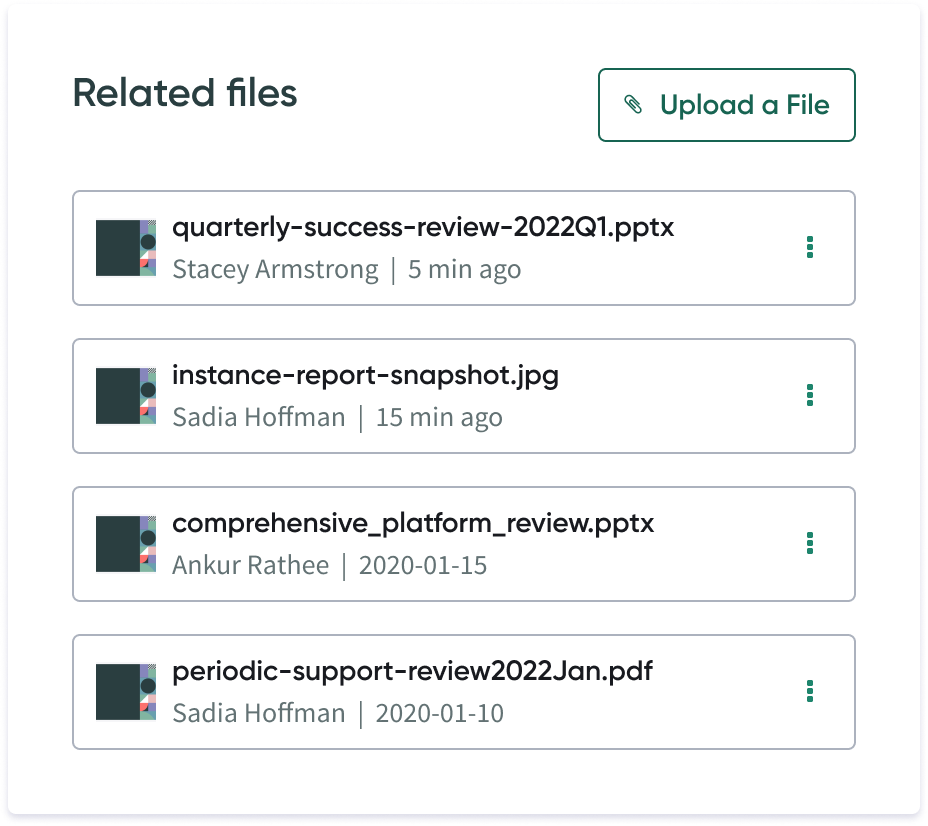
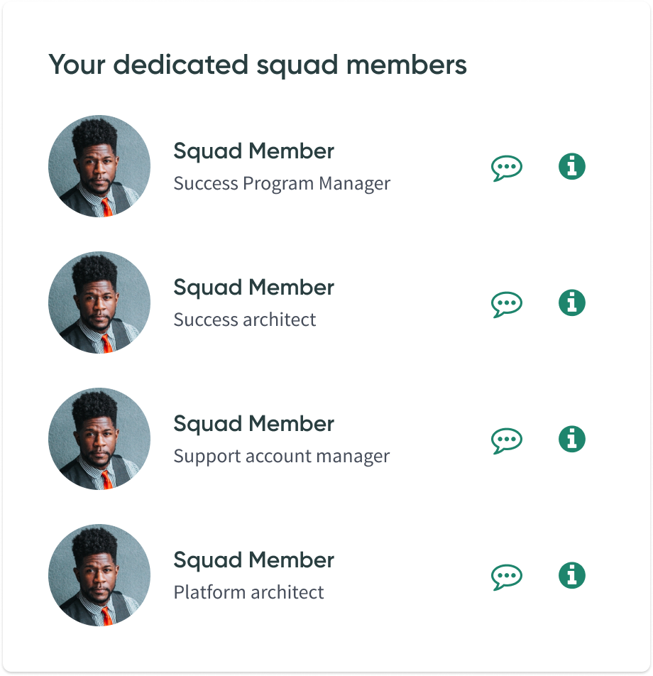
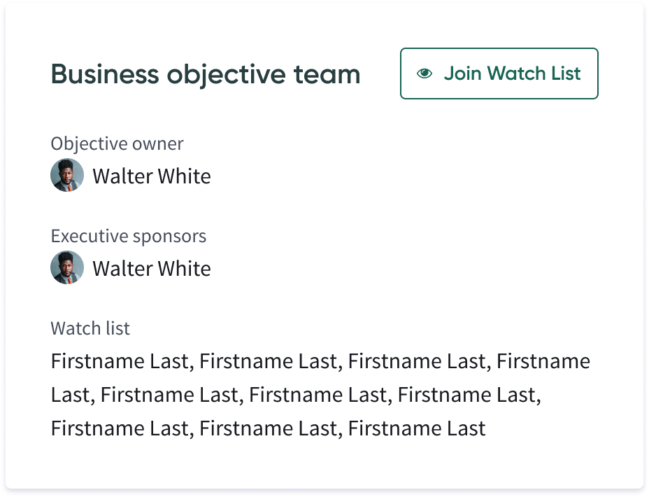
Every supporting surface got the same structural treatment.
Annotation & Documentation
Documentation covered two layers: the system itself, and how it behaved once it was actually applied.
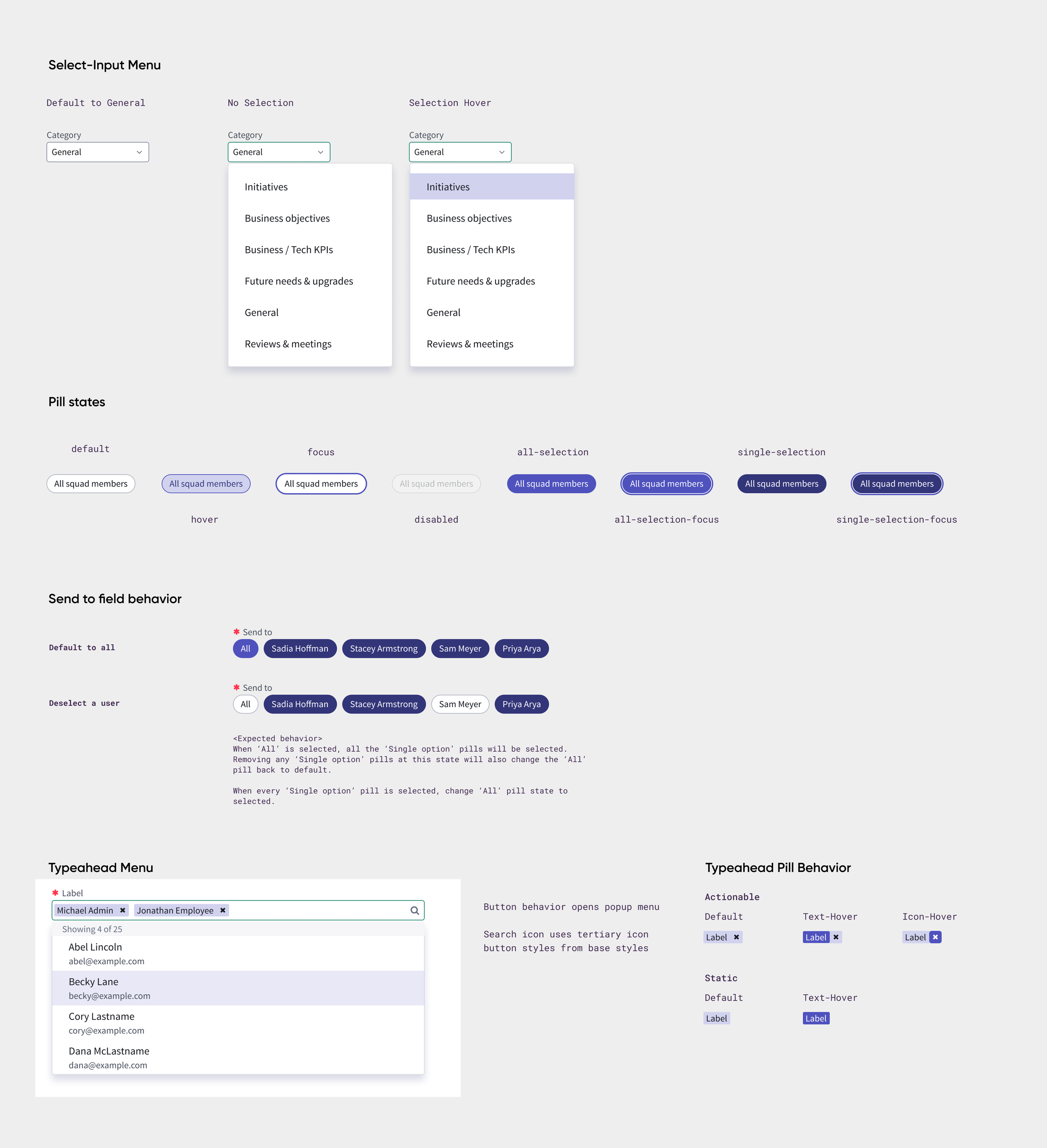
At the system level, every component across the library got the same rigor: every state, from default through hover, focus, selected, disabled, and loading, fully specified. That covered the full breadth of the system, buttons and inputs through complex patterns like kanban cards, spanning dozens of components and the pages built from them. Typography, color, and elevation were tokenized and named rather than just styled, so engineering could reference a value instead of pulling a hex code off a mockup. Data visualization got the same rigor: charts relied on alternating contrast and pattern, not color alone, so colorblind users could read them without a workaround.
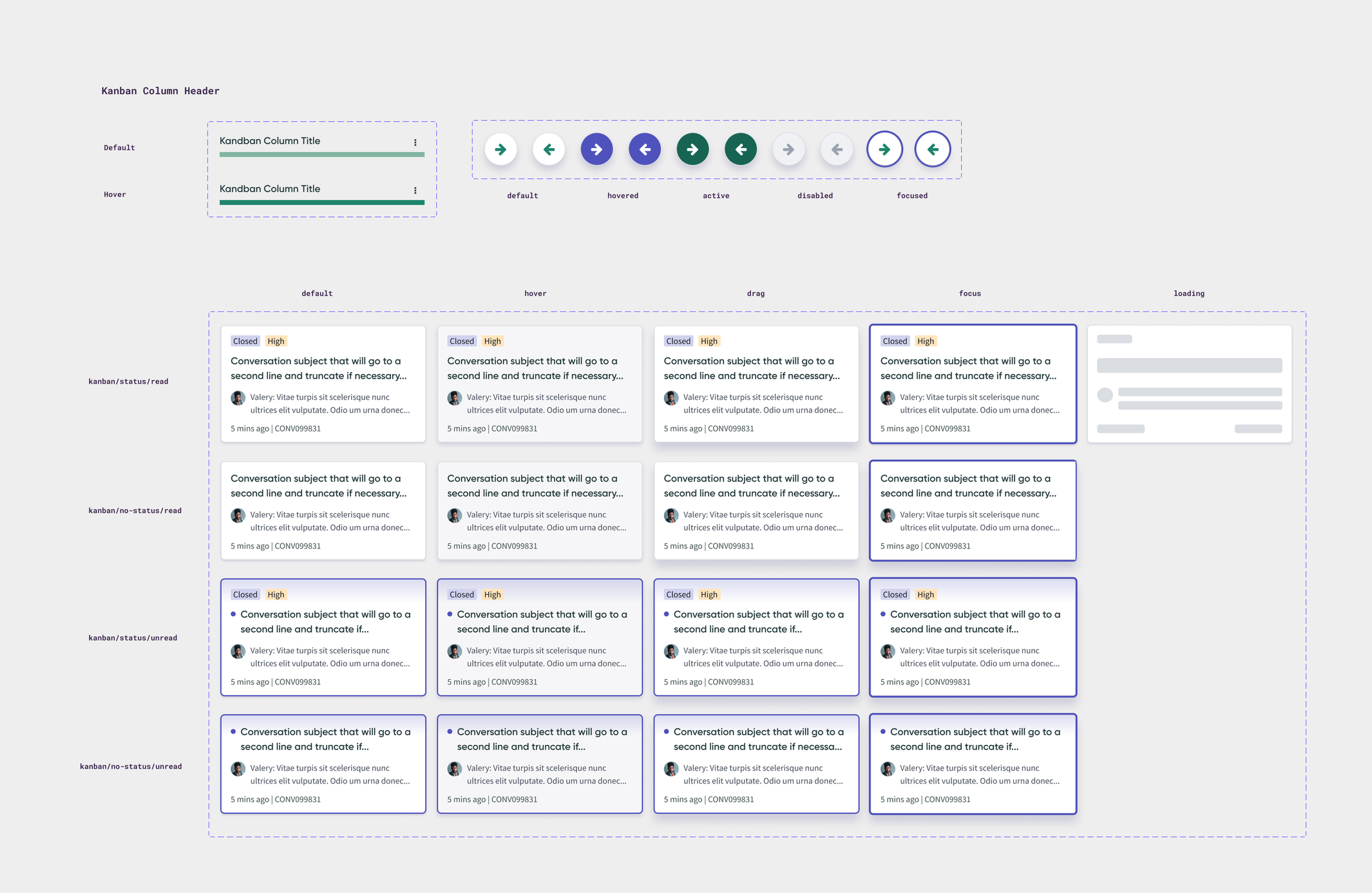
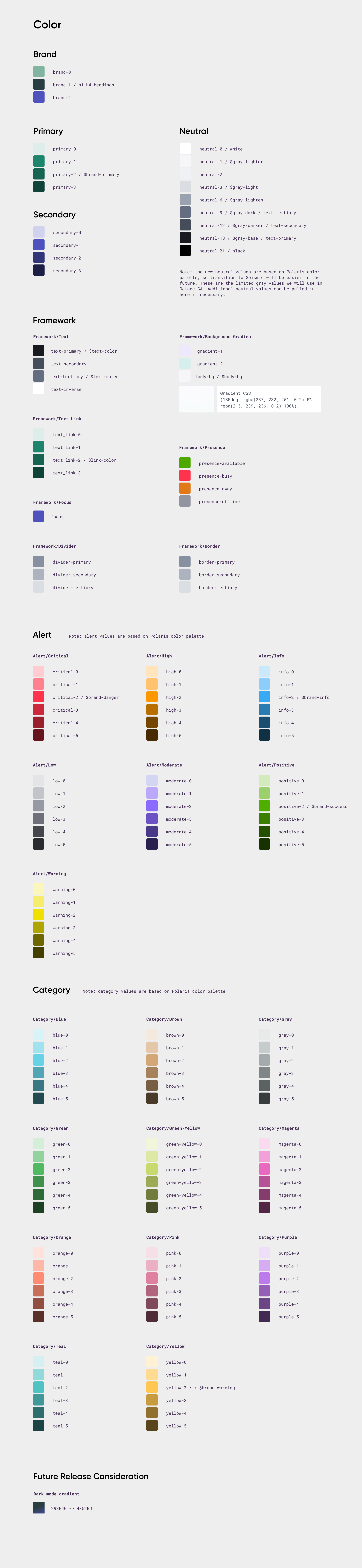
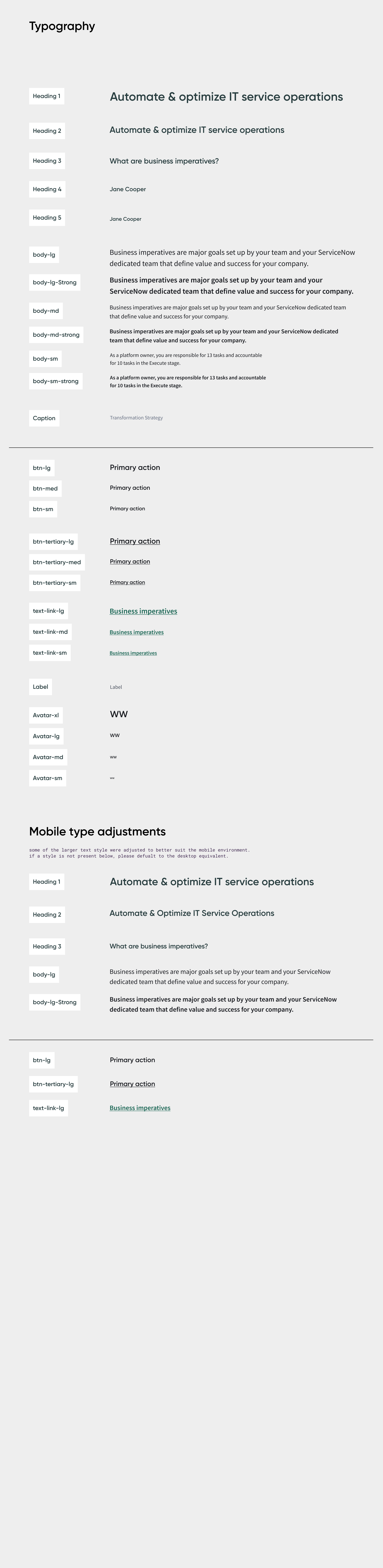
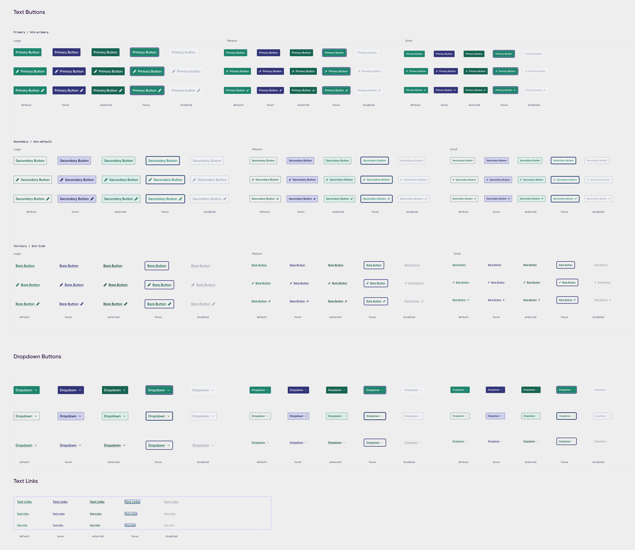
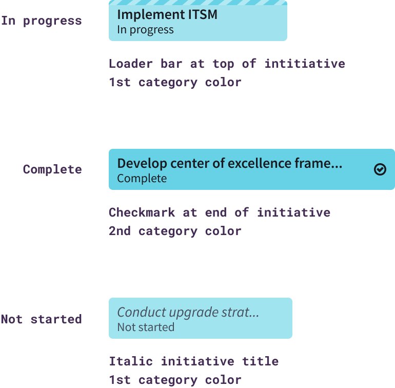
At the applied level, I annotated behavior directly next to the artboards. A visual key paired each state with its treatment: a loader bar for in progress, a checkmark for complete, an italicized title for not started. Scroll rules, sort order, and what stays anchored on screen got called out in plain language, and spacing rhythm was marked across three breakpoints so responsive behavior was specified, not assumed. The project also required versioned-scope documentation, so I noted what belonged to v1 directly on the artboards, like limiting the roadmap to "in progress" objectives until filtering shipped in a later phase, so engineering always knew what to build now versus what to expect later.
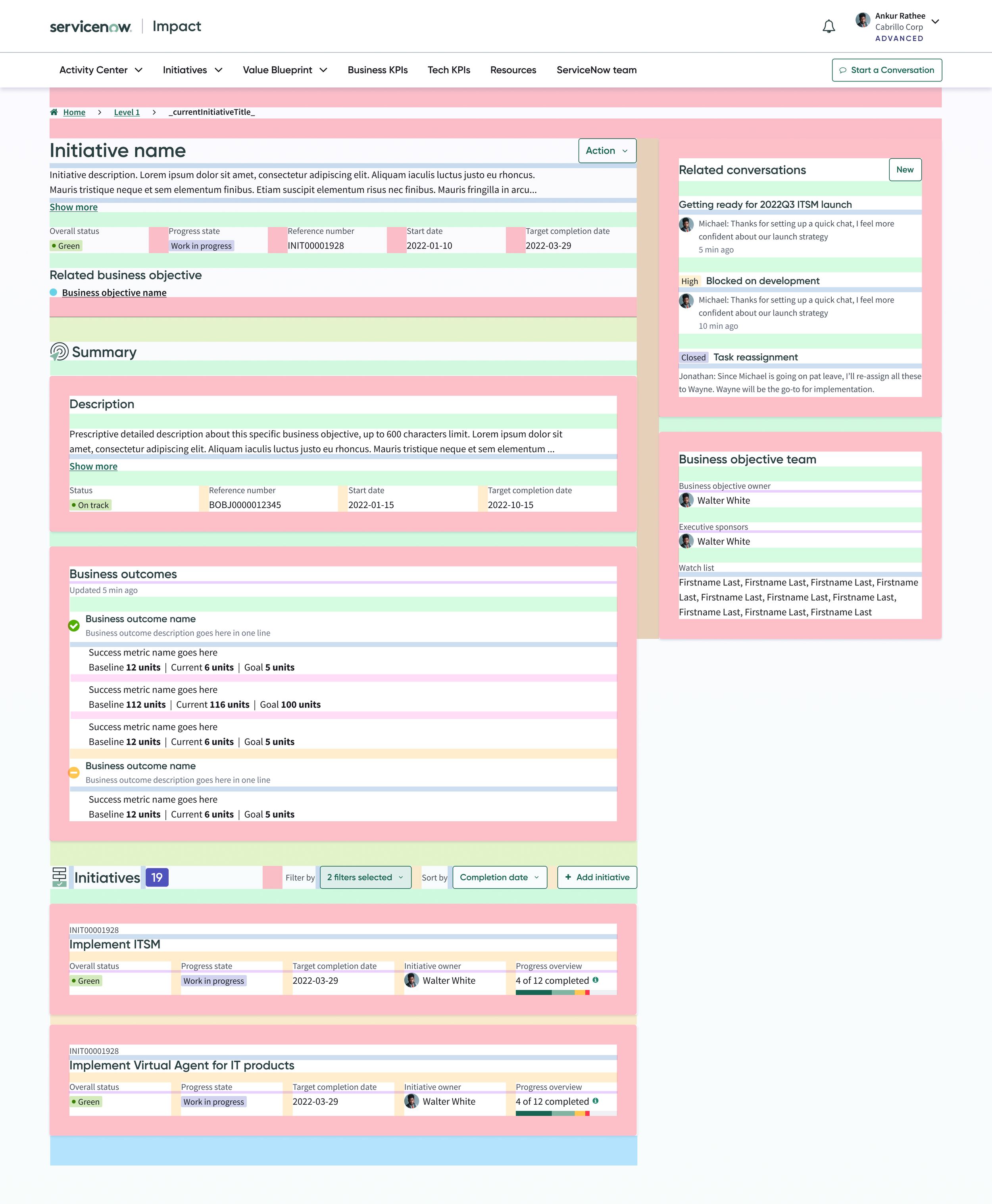
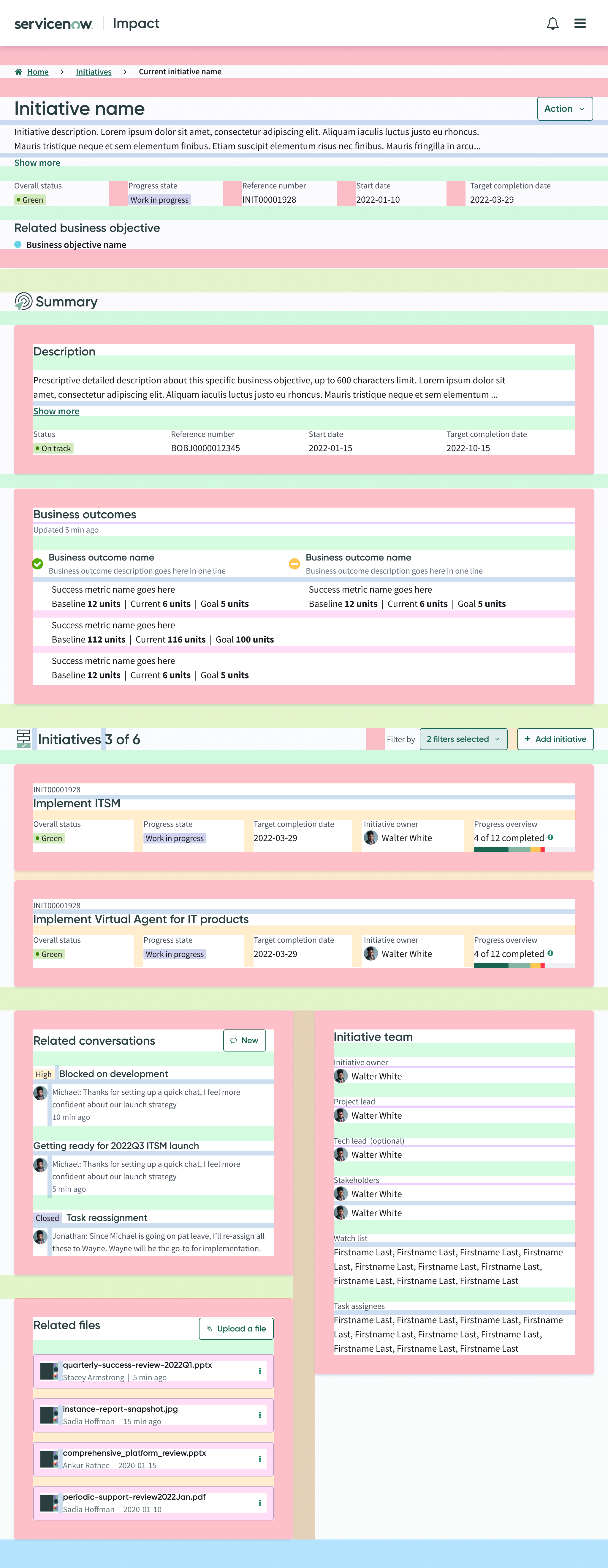
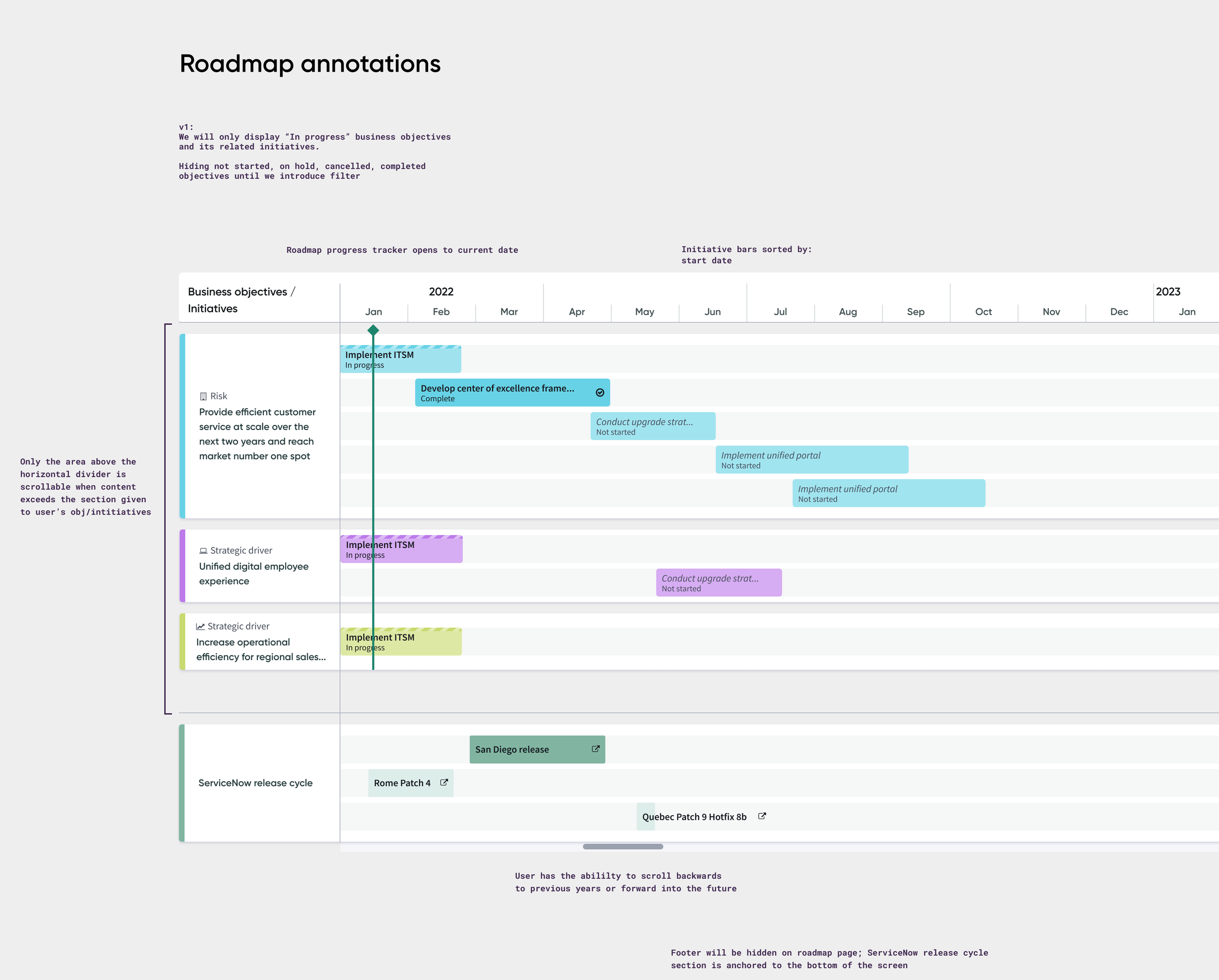
None of it was decorative. Every annotation existed to answer a question before an engineer had to stop and ask it.
Brand into Product
Systems and product work aren't the whole story. Some of my strongest work sits at the point where brand identity turns into something people actually use.
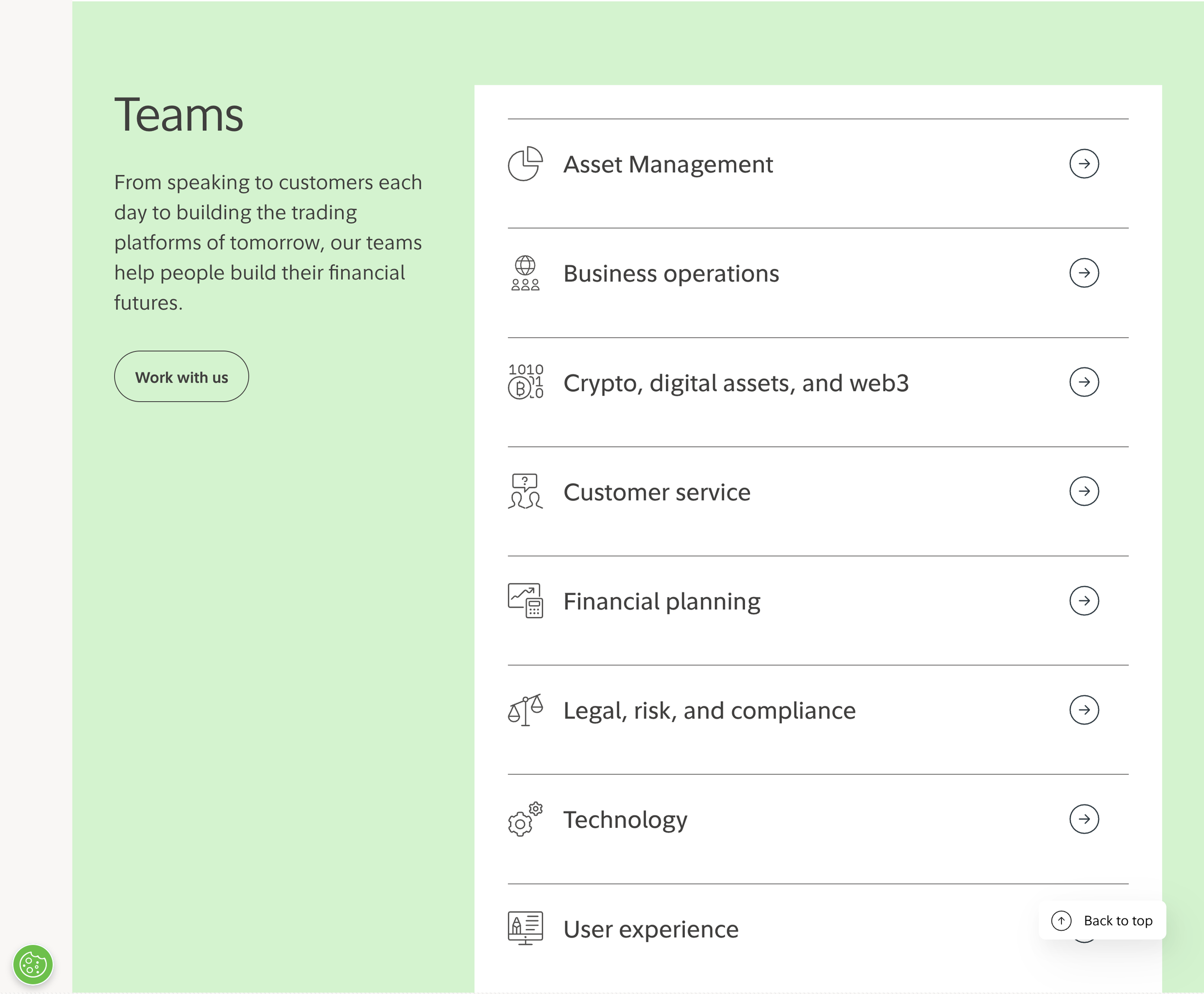
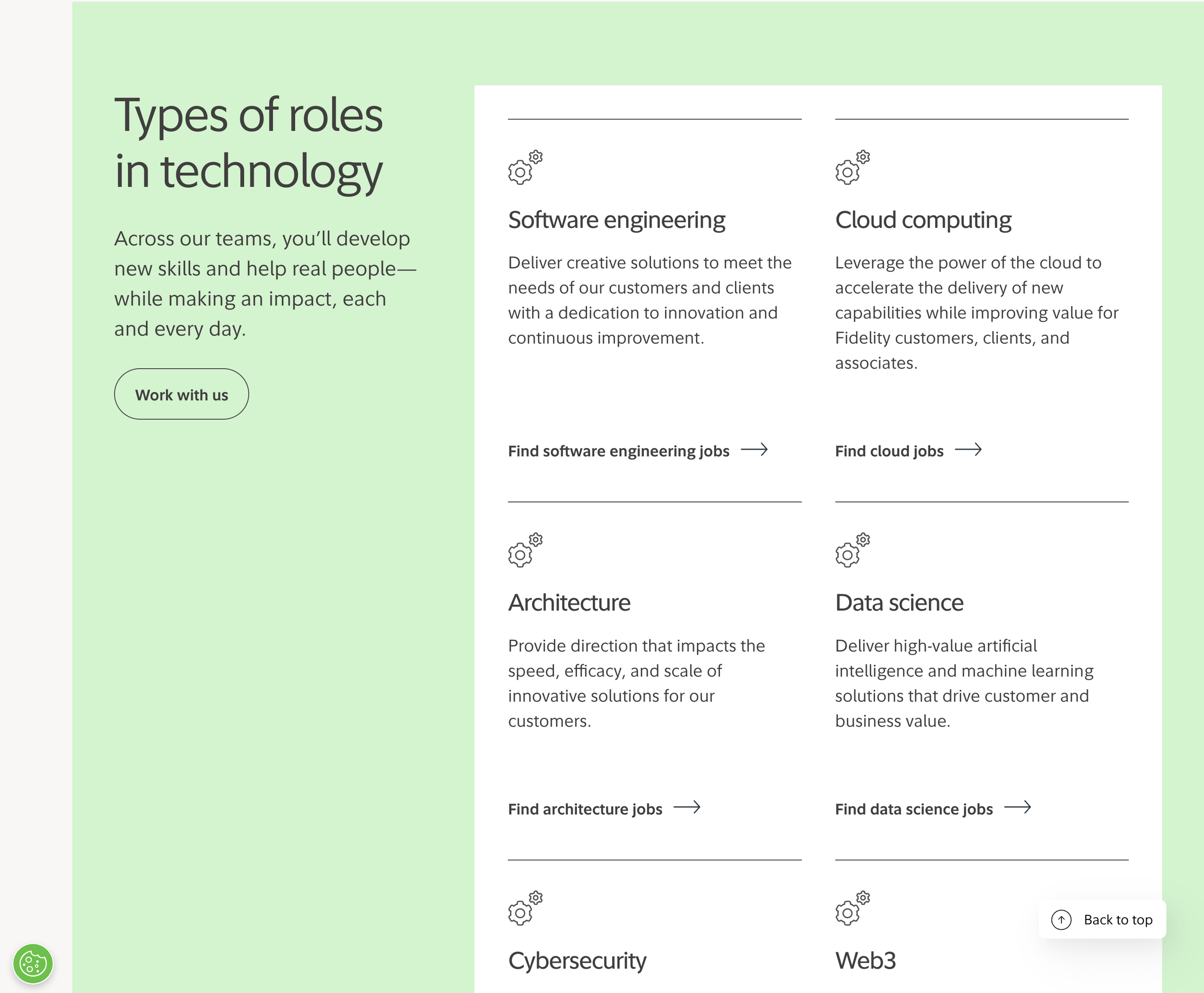
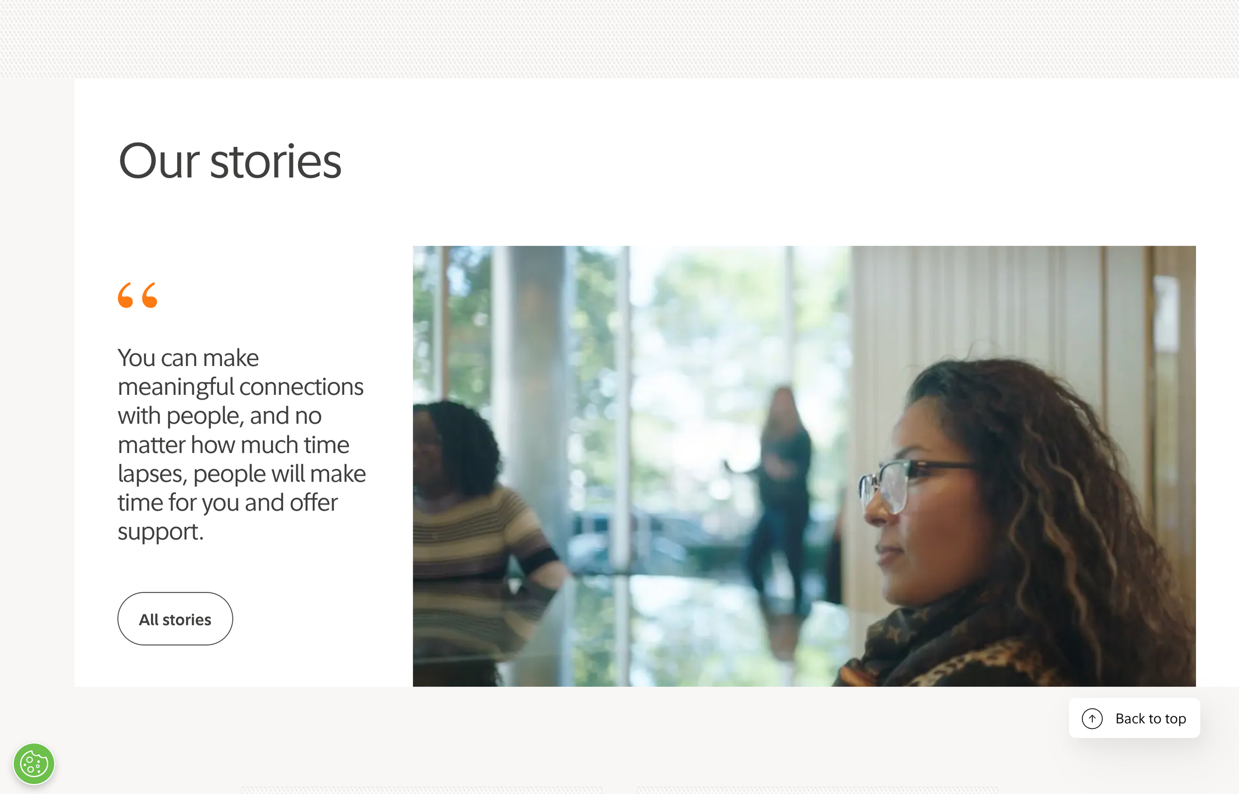
jobs.fidelity.com needed more than a visual refresh. There was no shared style guide, no reusable components, and no consistent way to structure content, so every new page started from scratch. I built a scalable system instead, a component library, a content model, and a set of patterns that held up across the whole site. That's what let the site actually show Fidelity's story instead of just describing it.
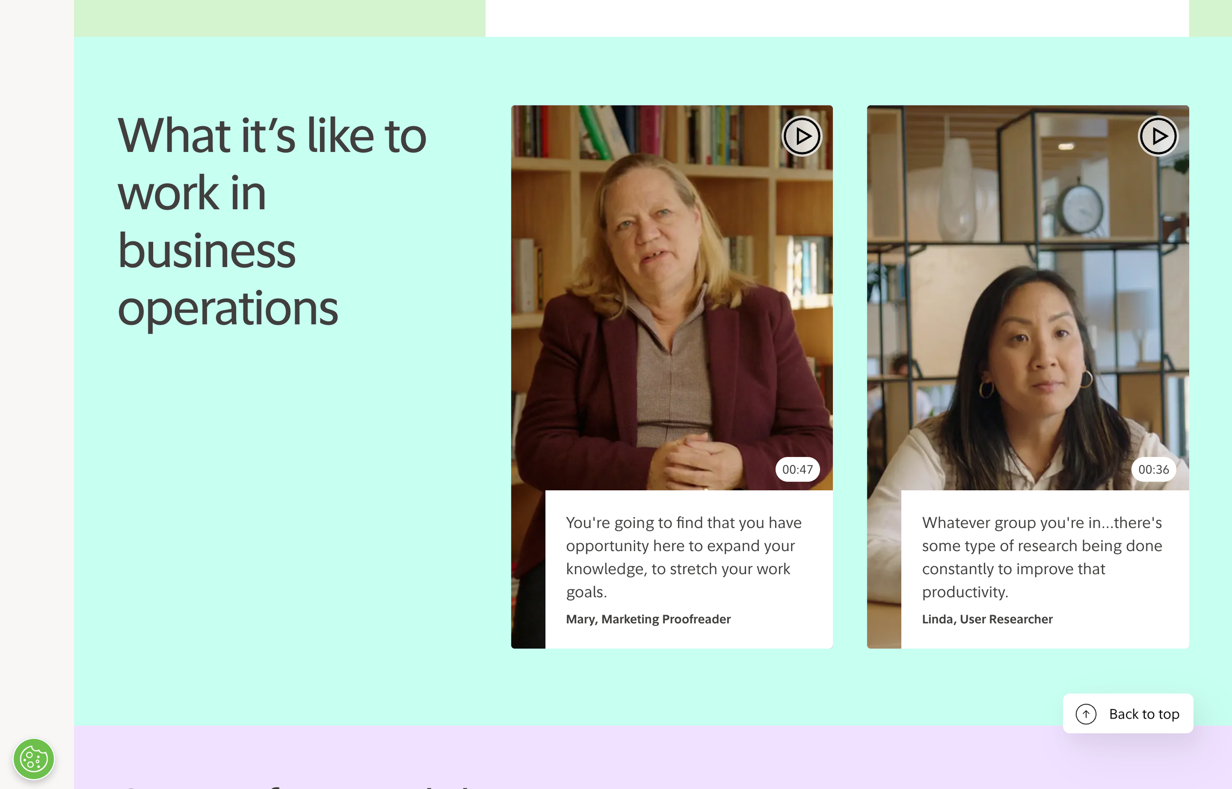
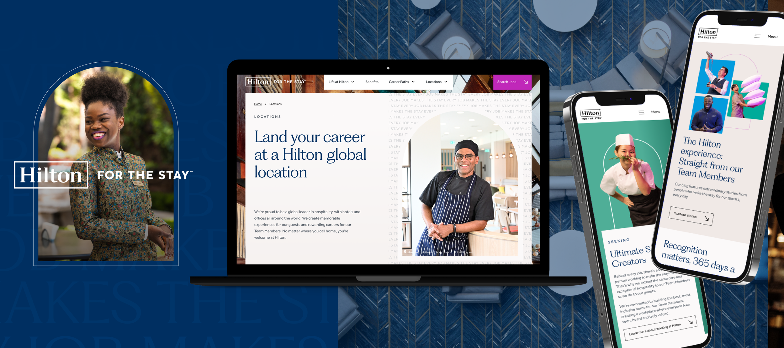
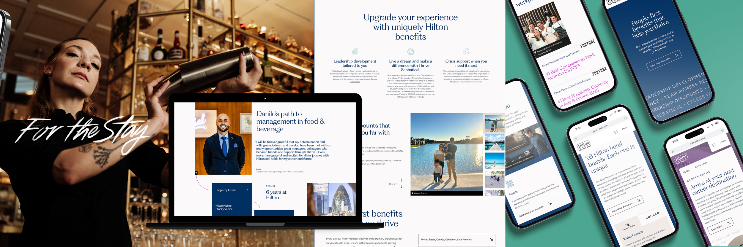
Hilton's career site rebrand asked for something different. Stakeholders wanted the site to make one thing clear. Working at Hilton is a destination, with real opportunities to grow and locations across the globe, and none of it works without the people who show up every day to make it run. Their own slogan says it best, "Every Job Makes the Stay." I led creative direction end to end, connecting team members directly to the locations they work in and building a site that carried that message instead of just stating it.